As digital content multiplies and attention becomes the most valuable currency, only the brands that create genuine connection will be remembered. If your design doesn’t stop the scroll, it risks disappearing into the noise. But great design goes beyond grabbing attention. It builds familiarity, consistency, and emotional connection that keeps your brand in people’s minds long after they’ve moved on.
At Airfoil, we believe the strongest brands go beyond aesthetics. They’re designed not just to catch the eye, but to stay in the mind.
Design for Recall, Not Just Reach
It’s easy to chase what’s new, whether that is new trends, new fonts, or new effects. But in the rush to “stand out,” many brands lose what actually makes them recognizable.
True recall comes from consistency. Every color, typeface, and tone of voice should feel like part of the same story. Familiarity builds trust, and trust builds memory. Think of McDonald’s golden arches or Nike’s swoosh, those brands didn’t become iconic by reinventing themselves every year. They stayed consistent while evolving strategically, building a visual language that people recognize instantly, even without a logo in sight.
Design isn’t just decoration but a guiding direction, and when your visuals align with your message, your audience doesn’t have to think twice about who you are.
To create that kind of lasting connection, we’ve outlined four guiding pillars that shape how strong brands are built and remembered.
Pillar #1: Every Pixel Serves a Purpose
In today’s fast-scrolling world, design has shifted from being purely aesthetic to being deeply strategic. Every pixel, color, and layout decision should be intentional, crafted to capture attention and convey meaning in seconds. Short-form video, motion graphics, and interactive design have become tools that stop people mid-scroll. But what matters most isn’t the movement itself, rather the meaning behind it. Great design isn’t about adding more; it’s about designing with purpose.
How to do it:
- Focus on clarity over clutter. Your audience should understand your message in the first few seconds of viewing your brand design. Simplicity isn’t about stripping things away; it’s about guiding attention where it matters most. Every element should support comprehension, not compete with it.
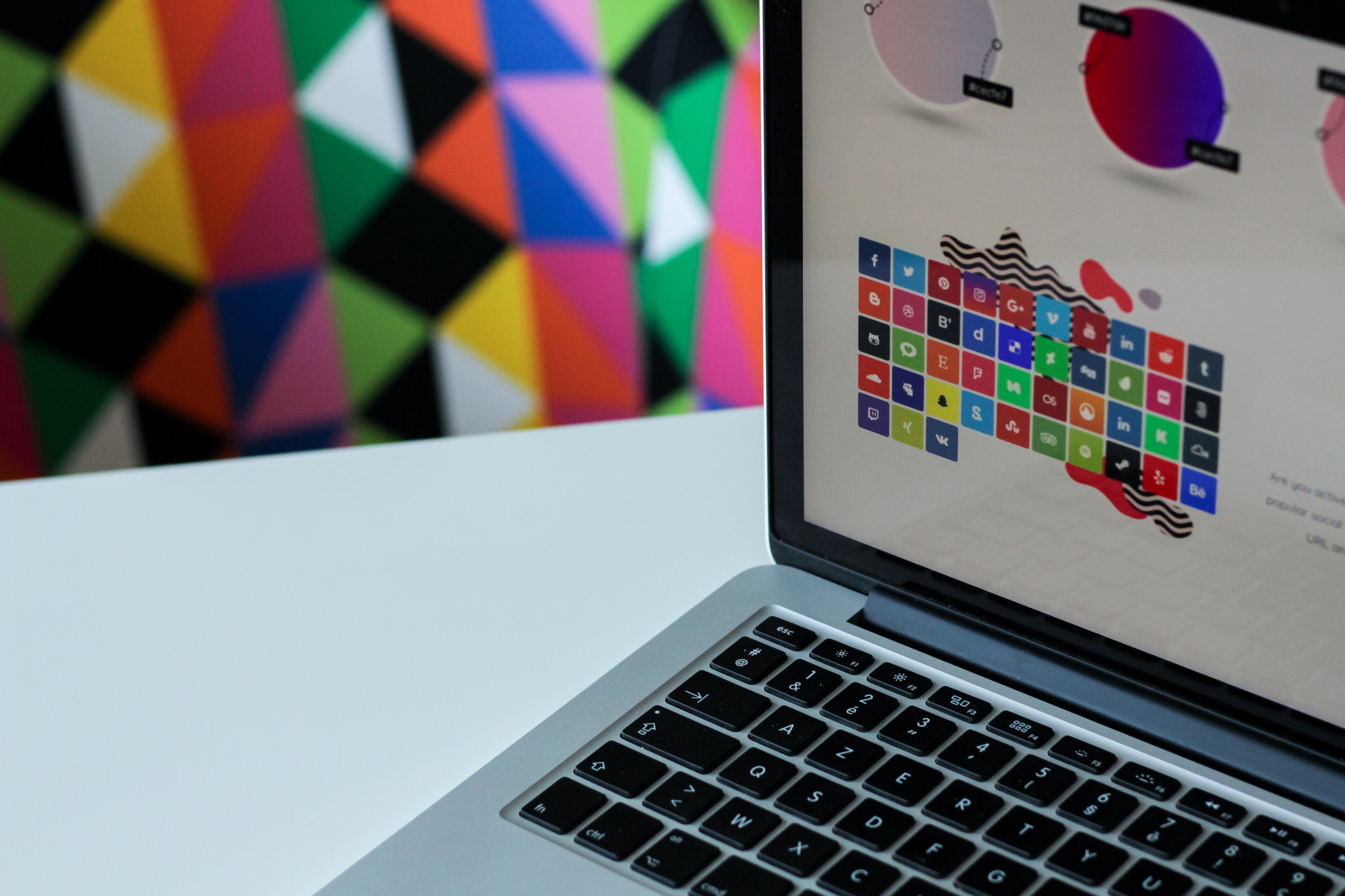
- Optimize the platform you’re using. Every channel has its own rhythm, audience, and expectations. What performs on Instagram might fall flat on LinkedIn. Tailor your visuals, tone, and format to fit the space they live in and treat context as part of design.
- Design for the small screen. Most people will experience your brand on a phone, not a desktop. That means type must be legible, contrast must be strong, and layouts must adapt seamlessly. If it doesn’t work on mobile, it doesn’t work at all.
- Be able to explain why every design choice exists. Every color, font, and visual decision should have a reason to exist. If you can’t explain why it’s there, it’s probably in the way. Purposeful design builds credibility and keeps your brand visually disciplined.
When strategy drives creativity, design becomes more than attention-grabbing. It becomes unforgettable.
Pillar #2: Make Emotion Your Design Superpower
Design connects most powerfully through emotion. People remember how a brand makes them feel long before they recall what it looked like. Color, typography, and layout all play a role in shaping that feeling. The right visual tone can signal trust, optimism, excitement, or calm, depending on your brand’s story and goals.
When design choices are grounded in emotional intention, they go beyond surface-level appeal. They create recognition that lasts. A consistent emotional language across your visuals makes your brand feel cohesive, familiar, and most importantly human, qualities that are increasingly rare in today’s content-saturated world.
Pillar #3: Balance Consistency with Evolution
Design is never finished; it’s a living, evolving part of your brand. The challenge is knowing how to adapt without losing the core elements your audience already recognizes.
Change for the sake of novelty can ultimately dilute your brand. Strategic evolution, on the other hand, keeps it relevant and sharp. Refreshing your visuals, testing new messaging, or experimenting with emerging tools like AI allows your brand to grow thoughtfully without losing its core identity.
How to do it:
- Start with research. Know your history and what’s already working.
- Treat updates as refreshes, not reinventions.
- Test visuals with A/B testing to take smart risks.
- Use AI as a tool, not a replacement for creativity or authenticity.
- Be transparent about how you’re innovating. Audiences value honesty.
A well-done refresh modernizes your look while keeping recall intact. It’s evolution that honors your brand’s roots.
Pillar #4: Authenticity Beats Trends
When brands try too hard to stand out, they often end up blending in. The biggest mistake is chasing trends that don’t align with who you are. Your audience can feel when something isn’t authentic. They don’t just want flashy visuals; they want to feel something real. That emotional connection is what makes your brand memorable, not the latest design fad.
How to do it:
- Be on brand first, then on trend.
- Maintain your voice and story across every platform.
- Avoid cross-posting without adaptation, context matters.
- Remember that emotion is more memorable than aesthetics alone.
Design That Stops the Scroll
Great design doesn’t just make people pause; it makes them remember. It’s consistent, strategic, and emotional. It’s rooted in story, guided by strategy, and built for the platforms people actually use. At Airfoil, that’s how we approach every project, with purpose in every pixel. When design is that intentional, you don’t just stop the scroll, you leave a lasting impression. We're here to help.